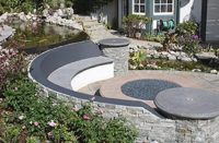
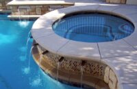
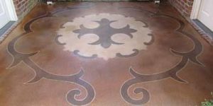
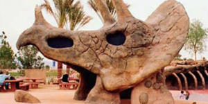
A pleasing hardscape is no accident. It is the culmination of preplanning and design that works harmoniously with a surrounding structure. A hardscape should never stand out, nor should it be so insignificant that it can easily be ignored. Nailing this balance project after project takes great effort, but the reward is far more than monetary. Concrete hardscapes last decades, and so do the reputation of the concrete artisans who successfully pave their way into decorative history.
Over the next few paragraphs this article will describe why some decorative concrete hardscape projects look appealing and why some don’t. The lesson of past mistakes, both mine and others’, can enhance your opportunity to transform shades of color into eye-catching spaces of hardscape elegance.
If you plan to make a living by way of decorative concrete, you will eventually have to completely grasp a hardscape’s blend of natural color and design. Please don’t underestimate this concept, because a failure to grasp the need for pleasing combinations will often lead to an unnatural blend of hardscape and structure, which will result in a less-than-appealing outcome. If you remember only one point please let it be this: The structure or building always dictates color hue and design, but only after functionality. This also means that the hardscape should not be a shrine to your flamboyant artistic concrete ability.
The design
Rarely will a project’s decision maker produce a complete set of working plans that include color, texture, pattern or finish. This is far too often left to the hardscape artist — you — who in return must muddle through many design options before unloading the first tool onsite. Seasoned decorative concrete professionals often refer to this period as “front-end work.” This part of the hardscape design process could take one afternoon or it could take months, depending on the complexity of the project or decision maker. It is never recommended that you rush through the front-end design stage of any project.
The top two components to consider when designing a hardscape project are functionality and taste. For instance, an aggressive cobble stamp pattern is not a good idea when designing the hardscape for a local assisted living project, nor is including too many elevation changes or narrow pathways. The intended function of the project should supersede all other design considerations.
The design plan should include three components; flow, texture and color. Flow involves the formation of the hardscape and the course of travel through it. The purpose and function of the hardscape project should dictate the hardscape’s configuration. For instance, a patio area should comfortably hold tables and chairs for seating but not be overtextured so that surfaces are unleveled. Walkways or pathways should connect to the patio with flow that is organic but does not encroach upon the patio’s seating arrangement. This transition from patio to pathway is a great opportunity to introduce another pattern, texture, band, color, or anything else that the decision maker finds functionally appealing.
Expansive, or wide, hardscape areas will need multiple forms or shapes of interest. Large areas of concrete hardscape are less appealing without shapes of contrasting texture, pattern or color.
The opposite is true with long, narrow pathways or walkways. Design linear hardscapes for narrow pathways that include interlocking imprint stamping or a tightly spaced transverse pattern of some kind. Keep straight formwork crisp and free-flowing curves smooth. Regardless of the design, the texture must be consistent in the pattern’s depth and layout parallel to the abutting structure.
The abutting structure should play a major role in both design and color. Some architectural building designs will limit pattern and texture choices. For example, a colonial home will look odd with a Paris fan stamp pattern but fine with a brushed finish over a colored concrete surface. Of all stamp patterns, texture patterns are most universal and compliment a wide variety of architectural designs and structures.
Let the structure’s facing elevation help determine a hardscape’s design. Pay close attention to the building’s architecture, shape and style.
The color
Color is the catalyst of an appealing hardscape project. Again, a hardscape color hinges on the structure’s hue and should never compete with it. The hardscape color, or colors, should be at least a shade lighter than the dominant structure color, and the only exception is a secondary release, or antiquing, hardscape color. This can sometimes be challenging in new construction because many times the hardscape is installed before the structure receives its permanent color. Be sure the decision maker chooses at least the structure’s dominant color before finalizing hardscape hues.
Color is a vital part of a hardscape’s natural order. The hardscape must organically blend with all landscape surroundings, in good harmony. Many people who are new to the decorative concrete profession find it all too tempting to use a hardscape to grab attention. This seldom works and is rarely recommended outside of theme parks. Keep colors natural when designing in a natural environment and watch how many favorable comments arise from those who truly enjoy the appeal of a professionally planned hardscape project.
