Everyone I talk to always wants to know how I design the art that I create on concrete floors. I look at each design differently. However, I generally have three stages of design that allow me to reach to the end result, which is a very happy client with an incredible space to live in.
This article breaks down three different jobs and how I developed the designs for each, stage by stage.
The initial client meeting
When I first meet with a client I want to get to know them. Since I am designing based on their interests, I have to find out what is interesting to them.
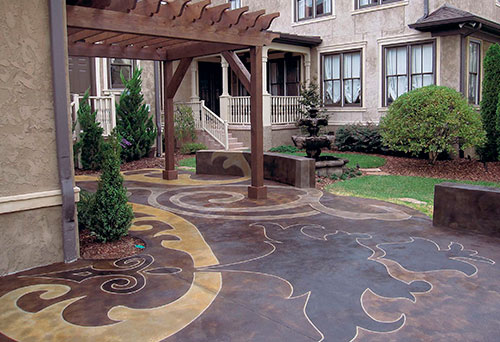
Take Liz Dishman (of Nashville, Tenn.) for example. She loves reading design magazines. When I visited her home to discuss a patio job, she had a couple of design ideas already laid out for me on boards with comments. While taking a tour through her house I saw consistent imagery that resembled fabric patterns. In the master bedroom, she pointed out that the patio would be seen from her room, and she said that the design had to take that vantage point into account as well as the one on the patio.
I also noticed the pattern on her curtains. This pattern was consistent with some of the images she was drawn to in her design magazines and some of the images I kept seeing throughout her house. With her expectations in mind, I sent her fabric-shopping for a pattern that she liked and I used that to create the design.
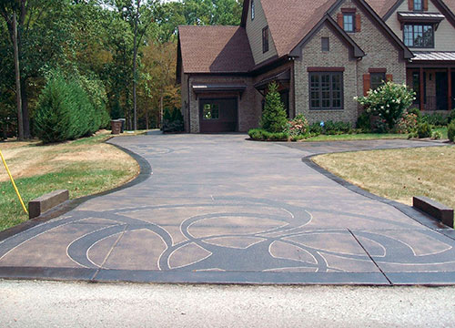
When I first met Mike and Kim Lomis (also of Nashville) I realized that they were a very contemporary family because of the styles of paintings they had displayed throughout the house. After discussions about creating a contemporary design I brought them a book on crop circles and pointed out that I could use those as ideas to create a flow through their garages and the driveway. The choice they picked was a great image that had movement and simplicity. Scale allowed me to use a complex shape that was so large it almost became simple across nice open spaces.
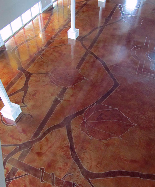
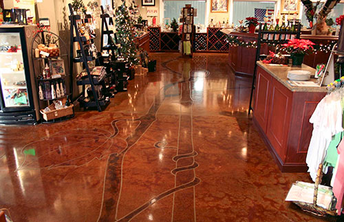
The owners of the DelMonaco Winery, in Baxter, Tenn., wanted the image in the center of their room to be a medallion that mimicked their logo. It was the rest of the space that I had to develop. When they mentioned the idea of their logo being used as a fountain I thought it would be clever to incorporate the vines from the vineyard as part of the design.
Preliminary designs
After these initial client meetings it was time to generate preliminary designs.
Liz Dishman gave me a piece of fabric that she thought symbolized her vision, and I sat in my studio and developed three designs for her patio. One was exactly what she gave me, laid out cleverly to fit the space. The second one was very simple because I modified the complexity of the fabric pattern. The third was over-the-top busy because I shrank and modified the pattern, then turned it to orient the design in the space.
With this project I was also controlling the forming and the pouring of the concrete. I love doing this because then I get to control scale, shape and surface texture. I usually have to work with an existing surface, which often means I have to work with broom-finished concrete outside.
After conversations with Joe Drake (who pours all my concrete), we created a patio surface that gave us texture and at the same time took the broom lines out of the equation, providing the perfect surface to work with. We created contemporary sitting walls in two spots that fit the space, and the design utilizes these walls. The final piece to the design was an arbor for a dining space. I used gold, black and walnut acid stain colors to separate spaces in the design.
The Lomises’ driveway was very large. I could not just take the crop circle idea and lay it out in one spot and be done. I had to be clever regarding how it would fit into the space, using both color and scale. Since someone driving by would see the color of the brick and roof I had to make sure I coordinated color to match. I chose black acid stain because it had a neutral grey and cold brown tortoiseshell coloring to it that I thought match the roof and parts of the brick.
The winery design was one of the hardest designs for me to come up with. Once I created it, the execution was not hard at all. I had about 6,500 square feet to work with and the main room was about 3,500 square feet of that. I wanted to come up with a design that meandered through the space while allowing the medallion to stand alone. I racked my brain over design after design after design. I tried to visualize so many angles of how the design would create flow through the space. I wanted to use the idea of a vine as my inspiration but I did not clearly understand how a vine really grows and moves.
The final design
Now how did I pull all this together on each job?
Liz Dishman picked the simple design out of the three choices I gave her. This made everything clear and precise and ready to execute.
The Lomises, on the other hand, did not require a design prior to the execution. Instead I thought about how a driveway design should be developed. I had a partial crop circle at the skirt, a partial at the turnaround and a full-size one that was 26 feet in diameter in front of the garage. After looking at those three variations I decided that I needed one more that just barely emerged at the outside edge of the driveway. I utilized a very similar idea with the same shapes through both garage floors.
The beauty of the winery design was that I threw out all the previous designs. I had all my employees sketch ideas to help me out. I almost made it a competition at the studio. And I ended up throwing out all of them and used the vines as the vision. I took long walks through the vineyard and analyzed how a vine grows, how it wraps around the trellis, and how large a leaf was in comparison to the size of the vine itself. I created walkways around the main room and through the rest of the building with the trellises. This gave me the ability to get creative with how the vines wrapped around the trellis and interacted with each other. Then I cleverly placed large leaves where they needed to be to finalize the details.
