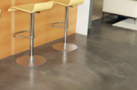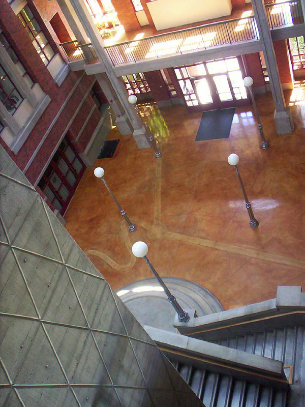
There’s something about its weight. There’s something about its economy of purpose, its honesty, and sometimes, its beauty. There’s just something about natural gray concrete. And the longer I’ve been in the decorative concrete field, with options for coloring systems ever increasing, the more I’ve come to appreciate it.
For me, this is especially true in cast-in-place vertical concrete. Gray is a bit of a staple, like bread and milk (or, better, bread and wine). However, it’s a memorable, indelible staple. It’s a constant, always the same and yet ever changing.
I remember construction of the Luxor in Las Vegas and my first exploratory trip to the job site. This was before the glass facade (or any facade or finishes) had been applied. Luxor was to be a giant pyramid, rising from the floor of the desert. This was fantastic concrete! The angled elevator cores. The deep horizontal beams. The audacity and gravity of the structure. And from the central atrium outward, the sheer volume of space that the concrete defined was stunning.
Coming after a first paragraph praising natural gray concrete, this next paragraph may seem a bit off-track. However, please bear with me. My first similar, and really memorable, experience with stained concrete was while staying at The Ahwahnee Hotel in Yosemite National Park. In addition to being a super-cool deluxe resort hotel, in what’s possibly the world’s most super-cool valley, this place is kind of like a lodestone for stained concrete guys. One visit and you’ll be magnetically drawn back, again and again. Rough-sawn vertical formwork, with wood grain extraemphasized and, horizontally, a groundin pomo Indian motif. All this over tens of thousands of square feet, with both walls and floors, even roof beams, cast in gray concrete that was subsequently stained. Stunning. Could anything possibly beat it? Well, maybe.
You see, The Ahwahnee was designed as a fireproof alternative to the original rustic, all-wood hotel, which had burned down. In light of this, design and construction of The Ahwahnee as patinastained concrete was probably most appropriate. It was contextually rich, with graphically stained floors celebrating indigenous basket-weaving designs and walls and beams simulating massive forest timbers.
However, might I be so bold to suggest that leaving the walls and beams unstained, and equally well coordinated with their backdrop of granite masses, might have been even better? Read on, McDuff. It’s coming.
I was later engaged to do stained concrete floor mock-ups for the Haas School of Business at University of California, Berkeley. UC Berkeley has quite a history of producing gray concrete buildings. Some are wonderful and some are, well, some are there. Clearly, this architect had intended to design something memorable, and had obviously taken a strong cue in style from The Ahwahnee. Here were these phenomenal boardformed walls in natural gray concrete. Slight, interesting lift lines, bug holes, and one giant fossil of the wooden formwork’s butt joints and grain. Indelible. As in The Ahwahnee, the floors were to be stained concrete — however, unlike at Yosemite, these walls were to be painted. Painted … I was aghast!
The pairing of a transparent, saturated stained concrete floor with these chalky natural gray concrete walls would be a natural. Like that staple of bread and red wine. And here was something even better than The Ahwahnee (if you can imagine that). Somehow, the pairing of things that are similar and yet opposites — stained/ unstained, sealed/unsealed, horizontal/ vertical — creates a symbiosis that can’t be beat! At least in my eyes.
I argued with both the owner and architect vociferously. I implored them to seriously reconsider painting the gray concrete. I don’t know whether they reconsidered or not, but, in any case, it was painted. The floors were stained by Joe Sanchez of J & R Floor Services, Clayton, Calif., and it’s a great-looking building. But not quite as great, in my opinion, as it would have been had the walls been left naked.
Just like I’m continually drawn back to The Ahwahnee, a more modern building (circa the late 1980s) that I find myself continually revisiting is Deschutes Hall at the University of Oregon in Eugene. This is one I was involved with to a very minor extent. The architect was Moore Ruble Yudell (the same architect that would later produce the Haas School of Business). I was a sales representative for L.M. Scofield Co. and was servicing a local painting contractor who was to be staining the floors of the interior of the building. He had no previous experience in stain, nor had the general and concrete contractors. In spite of this, they did a great job. Here was a brick and gray vertical concrete building enclosing an impressive, vast atrium space, featuring boldly designed sculptural gray vertical (and some horizontal) concrete paired with polished (in the traditional waxed, well-maintained sense), iron-saltstained concrete floors, rich and shiny as a freshly polished shoe, with a combination of traditional, graphic-andavant- garde, tone-on-tone, schematic scientific motifs. Spectacular! Like flying in a loaf of bread from France and pairing it with a bottle of Opus One from Napa Valley (I am from California, after all). To me, this building and its combination of what I would truly term sensory concretes is a creative pinnacle.
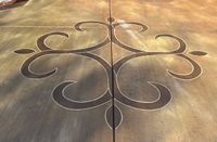
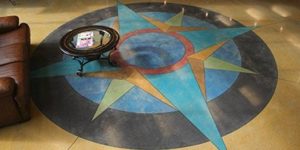
What it comes down to is … Rich flamboyant color is fantastic, as is something more understated and grounded. But just the right combination of the two is stunning. Stunning … like looking into the deep brown eyes of my wife, Jeannine. An artfully crafted, patina-stained concrete floor visually supporting a sculptural, spare gray wall. Or on a smaller scale and in the same plane, bits of color-saturated crushed glass aggregate as highlights in a traditional ground slab. Or a dyewash graphic, as in a watercolor with pencil line-work, against a similar field of natural gray concrete floor. Stunning and magnetic. Sure to be revisited.
