As the newest addition to UCLA’s Jules Stein Eye Institute, located near the Westwood Village campus gateway, the Edie and Lew Wasserman Building rounds out a trio of buildings that house research and programs dedicated to restoring and preserving eyesight.
The six-story, 100,000-square-foot building provides three dedicated floors for the Edie and Lew Wasserman Eye Research Center. The center includes operating rooms and various eye-related clinics, which will allow patient exams, testing and surgery to be conducted on location. The building also houses offices for the departments of neurosurgery and urologic oncology.
“The Edie and Lew Wasserman Building is designed to meet the Jules Stein Eye Institute’s growing needs, ensuring the institute’s development into the leading eye research and treatment center of the 21st century,” says Peter Hendrickson, UCLA’s associate vice chancellor for design and construction.
So it only seems fitting that the $114.5 million project, built by Morley Construction Co. and designed by Richard Meier & Partners Architects LLP, caught the eyes of the judges for the sixth annual Decorative Concrete Awards competition, sponsored in 2014 by the American Society of Concrete Contractors. The building placed first in the category of Vertical Application, Over 5,000 Square feet.
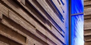
With an intriguing mix of facade planes and strong geometric shapes, the dramatic building features classic Meier elements: a marriage of glass-and-steel window systems, formed metal panels, cream-colored terra cotta panels and highly visible architectural concrete. The use of architectural concrete, in this case, was in massive concrete core towers that anchored the building at its east and west ends.

These concrete towers — one of the most prominent features in the design — were the first things built, says Joseph B. Didone, project executive with Morley Construction Co., the general contractor. “We determined it was easier to build the concrete walls ahead of the structural steel building,” he says. “So at one point we had these shear walls standing 110-feet high not tied into anything. It was quite a sight to see.” The walls were poured full-height floor by floor and then stacked.
“Layouts of reveals and lift lines, intended to align with future finish elements, needed to be precise,” says Chris Forster, vice president of Morley Construction. Consequently, electronic distance measurement (EDM) and global positioning system (GPS) layout instruments were used, along with more traditional methods involving plumb bobs and fishing lines, to achieve the level of accuracy the famous Meier modular design demanded.

“We consider concrete as a possible material for construction with most every project we design,” says Michael Palladino, Meier’s principal in charge of the Wasserman project. “When done by experts in construction like Morley, architectural concrete establishes a sense of permanence, stability and timeless quality.” His firm likes to design areas with large expanses of glass to bathe the interior with natural daylight, he adds. “Architectural concrete gives the stability needed to balance the lighter and more transparent component of the design.”
Concrete is also versatile, with subtle tonal capability, allowing it to pair well with a wide cadre of building materials, he says. “It’s completely flexible. You can design the texture and the color to be compatible with the building palette.”
The dominant UCLA palette is warm colors, and the concrete in the Wasserman building needed to boast color and shading that was compatible. “We like to mix gray and white cement to lighten the concrete, which makes subtle coloring of the concrete most successful,” Palladino says.
Extensive mock-ups were done to refine the mix design and forming materials ultimately used to construct the building. To achieve consistency in the architectural concrete’s color and texture, Didone says they had to ensure they used the same vendors and the same raw materials from the same batch plant throughout the entire construction process.
The project executive says besides the challenge of maintaining a consistent concrete color, there was the task of controlling the tie-hole pattern spacing. “It wasn’t your typical 24-inch on center spacing,” Didone says. “We had to have special plywood made (to make the forms) to meet the architect’s requirements.” But the end results were worth it, he concedes. The tie holes are his favorite architectural detail.
As a final product, Forster says, “The concrete within the Wasserman building not only provides the structural requirements needed in the building but also creates a cool, inviting appearance that blends and at the same time stands proudly apart from the other features of the building.”
One of the biggest challenges for the architect was integrating this building with the other two Stein buildings nearby, says Palladino. “This is a very thin building designed to maximize daylighting for all the building users,” he says, with expanses of glass on both sides as well as throughout the interior.
He’s very pleased with the building’s palette, placement, scale and massing. “By adding a third building to the Jules Stein Eye Institute, we’ve defined a great outdoor space and landscape for the entire campus to enjoy,” he says.
Project at a Glance
Client: University of California, Los Angeles
General contractor: Morley Construction Co., Santa Monica, California | www.morleybuilders.com
Architect: Richard Meier & Partners Architects LLP, Los Angeles | www.richardmeier.com
Scope of project: A six-story building that features glass and steel window systems, metal and cream-colored terra cotta panels, and architectural concrete. A total of 6,516 cubic yards of concrete were poured, including 2,429 cubic yards for the core walls. Wall form area totaled 91,569 square feet.
Cost of project: $114.5 million
Duration of project: Site preparation began in July 2010; building to officially open in October 2014
Most challenging aspects: Protecting two free-standing shear walls that were 110 feet above grade during the entire construction process. By nature of the design, the concrete walls were the first thing erected.
Awards: First place, Vertical Application, Over 5,000 Square Feet, 2014 Decorative Concrete Awards, presented by the American Society of Concrete Contractors Decorative Concrete Council; Best Medical Project in the Los Angeles Business Journal’s 2013 Commercial Real Estate Awards competition; and a 2011 Community Impact Award in the Los Angeles Business Council’s Los Angeles Architectural Awards competition. The building’s core and shell also achieved the Leadership in Energy and Environment Design Gold certification from the U.S. Green Building Council.
