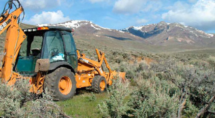
It’s 7:00 am. I’m at 6,000 feet in high desert mountains. There was a light snow yesterday afternoon, followed by heavy winds and rain, and then a harsh freeze. I’m sitting by the fire trying to warm up and satisfy John Strieder’s unrealistic editorial performance expectations. (“What! You think I’m Jack London, or something?”) You see, it’s two weeks past when the editorial calendar said my column was due, but I didn’t have the calendar. Or, if I had it, I’d never looked at it. In any case, he gave me an extension, “Monday, May 10, get it Miller? It’s drop dead, no later!” I got it! Kinda. It’s now 7:15 a.m., Monday, May 10, and I’m at “construction base camp” in northeastern Nevada at The Visual Concrete Group’s primitive (completely “off the grid”) Po’ Mike El Rancho/Retreat, developing our water well. With any luck, I’ll get this done by noon, track down a Peruvian sheepherder with a solar-powered satellite uplink in his little caravan, e-mail this in and meet my revised deadline.
So, this trip to the desert reminds me of another. I recently attended Concrete Decor magazine’s first annual Concrete Decor Show & Decorative Concrete Spring Training, in Phoenix, Ariz., where I presented a workshop, “Step Into The Clarity of Sensory Concrete,” and gave the kickoff address. While my address was at the end of the first afternoon, just before the cocktail get-together, the big guns, Fu-Tung Cheng and architect Will Bruder, were co-featured early that morning as the conference keynote speakers. Fu-Tung is someone whose work I know quite well, but I wasn’t familiar with Will. However, both of my workshop panelists, Steve Crocker and Emily McClintick, were.
In fact, Steve presented me with a recent copy of Architectural Record, which featured Will Bruder + Partners Ltd.’s Agave Library, a Glendale, Ariz., building that is part of the Phoenix Public Library system. Emily said, “Mike, ya just gotta go see it!” And so we did. And it was fantastic!
The Agave Library has something in common with Mount Lewis and the Shoshone Range, which loom above the Po’ Mike El Rancho/Retreat. And what they have in common is something important for us to remember, from a design standpoint, in the business of producing sensory concrete.
The importance of contrasts!
Evil allows you to appreciate good. The occasional really bad customer makes you appreciate all the more the even more occasional really good customer. Night makes you appreciate the day. Cool makes you appreciate warm. And now we get to the subject of this column: An absence of color allows you to appreciate all the more a really saturated color.
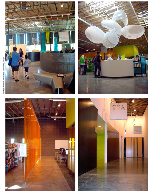
It’s early May, spring in the Nevada high country, and this means that patches of grass are extra green against the gray and dull brown rocks and soil of the land. Wildflowers in brilliant yellows and purples and gorgeous pinks – and the occasional stone in deep blue or green, turquoise or aventurine – visually delight everyone, even the most jaded locals. In Arizona, it’s the wildflowers and the deep greens of the saguaros and unbelievably red reds of the cactus flowers.
In concrete, sometimes it’s best that the concrete take a back seat. Sometimes the most simple and least sexy concrete is in fact the most appropriate. It acts as a neutral canvas and provides visual space for other things to stand out and really titillate. Sometimes grays and dull browns are just what the doctor ordered.
Hey, it’s 10:45. Better than noon… I’ve completed the column! The sun’s out and a little higher. My attitude’s a bit sunnier as well. Time to choke and pull-start the generator (no solar power yet – maybe next year) and sink that deep submersible well pump. I hope I’m able to find Shepherd Luis and his uplink this afternoon (EDITOR’S NOTE: He did), and I hope this gives you something a bit different to think about. Cheers! Signed, Po’ Mike.
