As concretists, each of us defines ourselves as “one who practices concrete poetry.” As we craft this material, we are crafting a poem. At the most basic level, that poem can be a haiku — deceptively simple.
The Hooks residence was the site of a deceptively simple residential project we tackled last winter in Las Vegas. This very large home is on the most exclusive golf course in Vegas. Really, it’s more like an ultrapricey boutique-style resort hotel. I wouldn’t choose to live there. I couldn’t choose to live there. However, for what it is, it is really well-designed — spare, rich. It’s deserty, Asian-inspired and done in a Frank Lloyd Wright style. The spaces, while large, are human in scale and still quite liveable.
Our principal emeritus, Kelley Burnham, was the designer. We were working on the porte-cochere, an area of less than 500 square feet with disproportionate importance, as it was the “welcome mat” to the home. There was a spa and pool in the backyard, visually linked to a water feature at the front entry by wave forms on an impressive interior sculptural plaster wall. Kelley needed to maintain this theme.
Also, the house was “stacked,” composed of block shapes in a rectangular style. At the porte-cochere, the house intersected the driveway, which was composed of tumbled rustic concrete pavers that meandered. The style of the driveway was really different from that of the house. So it was also Kelley’s job to make sense of this juxtaposition.
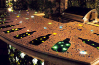
Her solution was to construct a composition of long, rectilinear, cast-in-place concrete paving elements that would float amidst the pavers. The idea here was that there would be no similarity between the shape and grain of these elements and the pavers. Kinda like the difference between a boat and the ocean. They belong together, they’re comfortable together, but they’re definitely not the same.
To guarantee that there would be no inclination to place the pavers in any way that subconsciously related to the concrete, the 4-inch-thick pavers were placed first by a totally separate crew. Then, the composition of the concrete elements was laid out and saw-cut through the pavers. After a bit of excavation and subgrade repreparation, the cut-out pavers would be replaced by 8 inches of concrete.

Additionally, there was to be a graphic subcomposition within the concrete elements. These were wave forms of brass (cut by water jet) and seeded amber crushed glass. This would further integrate the more organic natural elements with the geometric ones. It would also maintain the theme of water from back to front. We mocked this up, full-scale, in Northern California, out of paper, brass and glass. Bitchin’! It was smart. It was simple. It made sense, and the owner loved it.
When most people think of concrete, they think of it as one simple thing. This is wrong, for even in its most basic form, concrete is a complex material. It’s not one thing! At the very least, it’s cement melding stone. And here, at the Hooks residence, we had cement, stone, steel and nylon fibers, AND iron oxide pigments AND an air-entraining agent to prevent freeze-thaw damage AND a myriad of other admixtures to facilitate placement.
This is where I got more involved. Typically, the girls in our group are the design-heads, and I try to stay out of their way. I’m the more technical field-head, and they choose to stay out of mine. Good choice, as this smart, simple design was about to become progressively more difficult.

Brass tacks
Prior to concrete placement, the brass wave forms had to be secured in just the right place and at just the right elevation. There was no room for error. I’m a much better finishes guy than a concrete-forming and placement guy, so I got good advice from both Mike Price, my Northern Calfornia go-to guy, and Eddie Gray, finisher extraordinaire (and available in a pinch, as he resides in Vegas). Mike suggested presetting the waves from below with securely fixed posts. Ed thought it best to hang, with wire around straightedges, from above.
This was also tricky as the driveway sloped in multiple directions, and we were embedding what, for the most part, were flat and rigid elements.

We ended up using both systems. We hung the brass pieces the day before the pour and locked them in place from below, with the welded posts supported by minimortar beds. To prevent scratching, we also protected the brushed brass with multiple layers of blue tape.
Then there was the glass. These elements were to be “looser” versions of the waves. Kinda like a reflection of the brass in ripply water. These would also help ease the transition from the more architectural house to the more natural landscape.
Would the glass be integral? Would it be seeded? How would it be exposed? I pushed for integral glass, replacing a portion of the large aggregate, with an overall troweled finish and the glass exposed by sandblasting. Kelley insisted on the density of seeded glass and that its clarity be maintained through washed exposure. We have this love/hate thing, never seeing things from the same angle. This benefits our clients, as all avenues are explored.
 She won and I was further challenged. We would seed the crushed amber glass (two sizes, for maximum visual density) through plasma-cut thin steel templates, float and two-pass trowel, apply a “light exposure” top-surface retarder, and gently water-wash, using a pressure washer (operated by someone with a light touch), a hose and trigger nozzle, a soft-bristle broom and a small wire brush (for a more aggressive exposure of the glass waves, if required). This would happen the morning after the pour.
Finally, along with our client, we decided that the reddish-brown integrally colored concrete would be patina-stained too. This would produce a worn, layered effect, similar to the desert sandstone look of the house. It also softened our rectilinear construction, again easing the transition between architecture and landscape. And, finally, we thought, it would also patinate the waves of brass. (It didn’t — we ended up having to very carefully apply a brass-specific patination formula, turning the brass from a brassy yellow to something much darker and more similar to the amber of the glass.)
When all was said and done, we also applied a very light transparent dye wash (another layer of color and richness) and sealed with a thinned-down (to encourage penetration) solvent-based acrylic.

There was no room for error here, no visual fudge factor. This was not like an applied-finish job, where problems could be disguised with a bit more tint or another layer of skim. Nor was it like a stamped job, with distracting visual noise such as joints and variegation from texture and release agents built in. Here, all there was was concrete, and where the concrete interacted with the brass and glass. And this interaction was right in your face, right where it was easy to judge critically.
The client challenged Kelley. She challenged me. We challenged the local contractors. Together, we produced deceptively simple concrete that we could all be proud of.
I like to think of the project as concrete poetry…
Footfalls in red mud
Forever frozen, therefore
Be mindful of steps
This is good advice for any concrete job but was especially true on the Hooks project. Good advice, just in a bad haiku!
