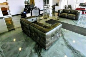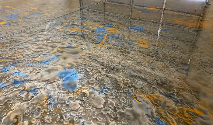
People ask me from time to time how many colors they should pick for their metallic epoxy floor. They also ask which ones I’d recommend when choosing metallic epoxy colors. I have 72 colors to choose from, so picking the right colors can be difficult. For some, such a large choice is too much, but for others, they are thankful to have choices. Nonetheless, the choice is theirs to make.
When choosing metallic epoxy colors, the colors you pick can make or break the outcome of your floor. Assuming you don’t want to be so disappointed that you want to redo it, which can be an expensive remedy, here are some guidelines to help your decision-making process.
I break the colors into three different categories: earth tone, exotic and contemporary. Earth tones are primarily browns, beige and copper. The grays fall under contemporary. Exotics include lime green, purple, blues and teal. In my professional opinion, for the most part, you don’t want to mix categories. Usually, mixing them doesn’t look right. I strongly urge you not to mix any gray with an earth tone color.

Whether I recommend two or more colors depends on the size of the job. If you have a 400-square-foot garage, office or retail space, pick two colors. If you pick more than two colors for a small space, the finished floor will look too busy. Similarly, for small areas, I suggest not to pick dark colors as these will close in the room and make it feel even smaller.
Black, white and red are very dominant colors. Unless the floor is going to be just one of those colors, use those strictly as an accent.
One of my flashing lights is triggered when people call and say they want a white/pearl floor. It makes me tense up and cringe. White is a very hard metallic color to work with. Here’s why: Metallic floors are already very translucent. The epoxy I use is clear and the color comes from the metallic powder. If someone really wants white, you’ll need a pigmented white epoxy to cover the prime coat in order to hide the concrete.

You also need to understand how the colors will blend with one another. A metallic floor’s pattern consists of pigments that disburse throughout the surface and bind where they meet and mingle. So, if you were to pick red and white, you would end up with a lot of pink throughout the floor. Think of a color wheel and choose colors that blend into an attractive mix.
You also want to think of the effect you’re going for. Although I use the same process, with light colors such as white, pearl or platinum, you won’t get the same “wow” factor you’d achieve with darker colors.
When I coat garages and the homeowner doesn’t have a color theme, I suggest either sticking to earth tones or going with the grays. When I coat commercial/retail/restaurants, I always look around to see their color scheme. I also like to ask what colors are on their business card, signage and logo.
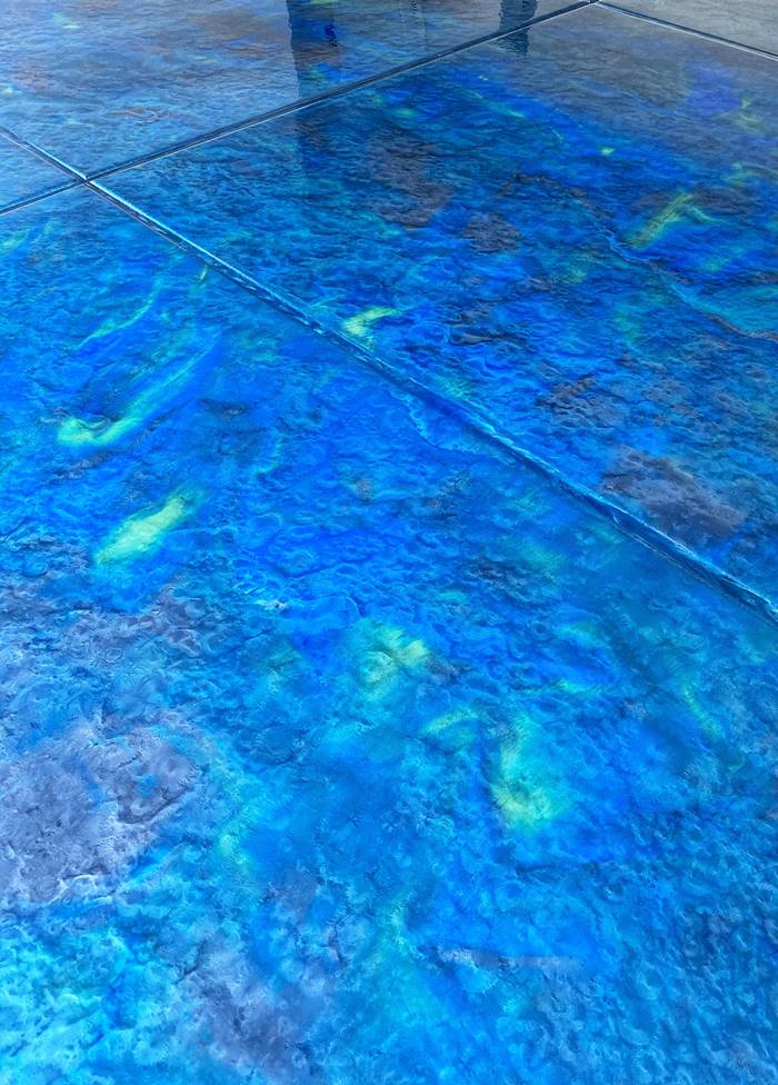
If I get called out to look at an empty commercial place, I always ask the owners what their color plans are for the project. I believe it’s really important for businesses to coordinate their own color schemes, but then trust the artist in me and let me run with it.
Regardless whether it’s commercial or residential, your floor will look best if you have contrast. So don’t pick all dark or all light colors, and make sure the colors don’t clash with one another.

