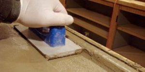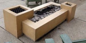
New Year’s Eve 2012 in Rancho Murieta, Calif., I had just finished stripping cast-in-place concrete countertops in an outdoor kitchen with concretist artists Emily McClintick and Greg Stanley.
What the hell was I thinking? After all, I’m a concrete philosopher and artist, a part-time columnist and full-time floor guy. I’m no countertop specialist! It’s generally best to call a countertop guy like Buddy Rhodes or Fu-Tung Cheng. These guys are most often best suited for the job. Most often. But not always.
It all started when I got a call from interior designer Julie Doran. Been a long time. Where you been? “Second career as a flight attendant, third career as a full-time mom. Now, I’m back into design.” What’s up? “Got a new client. I’m designing a tricked-out outdoor kitchen. I think you may be just the guy to do the countertops.”
Whoa! This is where alarm bells go off and I try to persuade the potential client to engage a specialist. She wouldn’t hear of it. Honoring our relationship, and because I might’ve been able to sort out who would’ve been the best fabricator for her project, I agreed to meet, figuring I’d be recommending Cheng Design or Tommy Ralston. No way was I interested in or expecting to be performing on the job!
Julie had done a great job of reviewing my portfolio, on her own and with her clients, Ken and Susan Catchot. Their project was an atypical residential outdoor kitchen. The home was large, on a large piece of land, on a lake, and with grapes. An estate. Their project was equally expansive. Detailed. Ambitious.
What Julie would design for the Catchots wasn’t just a kitchen. It was a themed environment. I’d done a lot of themed environments! Casinos, theme parks, malls, restaurants. This was either a very large residential kitchen or a smallish restaurant in a pretty good-sized casino.
The themes were wine and the Oregon Ducks. The Catchots had vineyards on their property, with plans for more. They had an appetite for good wine. Who could blame them? They also had a daughter at the University of Oregon. Nice school. Good football team. How about an “O” graphic or a duck, they asked. Hmm. I’d have to figure out a way out of that one.
They liked patinas (my bag). They liked the troweling of leaves and other things into slabs. How about troweling duck feathers? Ugh! How about green and gold glass? THAT idea wasn’t so bad.
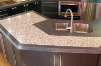
I pitched the idea that we seed tumbled broken wine bottles, green and gold, into the bar top. We could trowel grape leaves right off their vines into the kitchen counters, and we could grind the bar, exposing the glass.

And we could form the sides of both with oak, like a barrel of chardonnay. This was an especially bitchin’ idea because of the shape of the bar — 22.5 feet long, 2.5 feet wide, 3 inches thick, with an extreme cantilever and a lovely radius. It was this radius that supported the theme of the coopered cask. The size, shape and cantilever supported it being cast-in-place. And this was all reinforced by the fact that Ken was big and liked to party. A requirement: He had to be able to dance on the bar, on the very edge, so, not only was the thickness and structure of the bar top critical, the connection of the bar to the base and the base to the slab were as well.
“Ken, I didn’t think this would be the case, but you’ve just about convinced me to do it. We may be able to do this together. You don’t want to joint it right?”
“No joints!”
“OK. Because of the length, thickness and shape, it’s gonna crack. If it doesn’t crack, it’ll curl. Or both. It’s risky. You’ll need big balls.”
“I got ‘em!”
He did. I priced it high. He wrote the check. Turns out, he was more than gutsy. He was lucky too.

How we did it
First, the soffit (underside) was formed with plywood, and the joints covered with flashing, duct-taped in place. This was covered with waterproof building paper. Returns were formed with lumber. Where returns met the soffit, the plywood was beveled, allowing for less restrained shrinkage.
The vertical edges were formed with red oak sealed with a solvent-based acrylic. Joints with a potential for leakage were sealed with silicone (on the face side) and duct-taped (on the back side). We utilized several types of reinforcement: integral “stealth” fibers and three types of steel: 2-inch by 4-inch 14-gauge rolled fencing material tie-wired to flat 6-inch-by-6-inch 10-gauge mesh, tie-wired to light rebar. On the cantilevered bar, we tie-wired to heavy rebar instead and connected to the platform with U-bolts, through lumber and steel framing.

Most of the time, it’s the water, cement and stone that really make the difference in my work. This time, it was all about attention to detail in forming (preventing restraint and to provide texture), reinforcement, and connections (so when “Big Kenny” really got it on, bits wouldn’t break or it wouldn’t tip over).
The concrete (a 7-cement-sack-per yard pea gravel grout mix) was blended with a portable mixer. The bar was natural gray concrete, seeded with the broken, tumbled wine-bottle glass (from bottles of white wine only — greens and ambers, no dark greens).
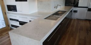
The countertops would be pigmented light tan with grape leaves troweled in, placed over two cool rainy days. The finish: smooth, not hard-troweled.
No edging. However, we did bang the crap out of the forms with a rubber mallet in lieu of vibrating. The idea was to minimize, not entirely eliminate, bugholes, as well as maximize oaken texture. We’d ease sharp edges later, with a polisher and soft diamond pads. We used no curing compound, but came back the next day, covering it with plastic and plywood. Concrete was allowed to cure for about a week. When the plywood and plastic were removed (with no cracking or curling apparent yet), I cut contraction joints in the countertops (near sink blockouts and so forth) with a diamond-bladed grinder.
The bar was left to “hang” (cure) au natural. Should’ve cracked somewhere in the middle — didn’t. Should’ve curled like elf shoes at the ends — didn’t.
I figured between the “fossil leaves,” ground-to-expose wine bottle glass and the bitchin’ sculptural radius (including the barrel lines and texture), I’d wear Ken down and convince him that additional graphics were unnecessary. Not! His force of will matched mine. I offered him a $4,000 refund … no! I offered him $4,000 and called him a fool … no!
Emily McClintick had been with me from the start. She also felt that the gnarly vine graphic we had decided upon was a mistake, though not as adamantly as I. I suggested that Emily complete the graphic. She’s a real talent, and Greg would have her back. Much better to have someone executing this who didn’t think it was a phenomenal mistake! The Catchots and Emily agreed. Emily’s graphic was smart as could be. She transferred the vine to the bar instead of just making an image. Greg used diamond blades, grinder and moto-tool to sculpt the graphic, with the grain of the cut and depth suggesting the wiry husk of the trunk. They copper-leafed the void, overfilled it with clear epoxy, and ground it flush. A mechanical process producing a rich graphic result, it was truly brilliant.
Client: Ken and Susan Catchot
Decorative concrete contractor: the concretist inc. | www.theconcretist.com
Scope of project: A 22.5-foot bar, plus about another 75 lineal feet of countertops — one beneath the bar, and one long L-shaped one running from under a roof to the open air — for an outdoor kitchen.
Materials used: Quikrete concrete augmented with Davis Colors pigments, Nycon nylon fibers and extra portland cement; Bedrock Industries broken and tumbled wine-bottle glass (greens and ambers from bottles of white wine), Colormaker Patinaetch acid stains, Colormaker Deso Dyes, Sherwin Williams Sher-Wood CAB Acrylic Lacquer Equipment used: Inter-Tool DS301 grinder/polisher, Makita variable-speed polisher, Preval sprayers, 100-grit sanding discs from Smart Surface Technology Inc., rigid diamond cup wheels


Project at a Glance
