Years ago my company, (Fort Wayne, Ind.-based) Dancer Concrete Design, completed a local art center project where the goal was to create the most neutral and plain-looking concrete floor possible. The thought was to create a neutral balance so the hanging art would be the focal point of the space and draw the interest of the viewer. While that floor looked nice, and the space is still warm and inviting, it didn’t really draw out any talent or imagination from our team.
When I was invited to bid a job for another regional art center, the Wassenberg Art Center, in Van Wert, Ohio, my initial thought was to do the same thing. They probably wanted the same type of finish — a gray polished floor that creates a neutral base and offers the long-term performance of polished concrete.
Instead, the finished floor of this art center brings in the arts wherever applicable. The new floor was one of the major changes to the space, and it presented the perfect opportunity to showcase local talent in artists who could work with concrete. Instead of creating a neutral floor, we went for bright and vibrant.
The development of a masterpiece
Our first meeting for this project was in a dark and dreary former National Guard Armory. The armory was built around the 1930s, but after being decommissioned, it never really fit the community. It served as a reception hall for a time and then tried a flea-market type offering. But expenses and maintenance problems left the community with two options — the historic downtown landmark had to be demolished or someone had to raise the money to completely renovate this space.
When we looked at the building for the first time, the ceilings were falling apart, the roof had leaks, and the space had a cold and dungeon-type feel. Beyond the debris and darkness was a large open space adding up to more than 8,000 square feet of concrete floor. Although this concrete was covered in black mastic, it was in visibly good functional and cosmetic shape. Now we had hope! Polished concrete floors would serve as the anchor point to transform the entire building.
Hope Wallace, executive director of the Wassenberg Art Center, had some experience with polished concrete and loved the shine and performance of the durable material. Looking at pictures online and reading articles about polished concrete and its ability to be colored and custom-designed fueled even more interest. The Wassenberg could use concrete as the finished floor in the main entry, bathrooms, kitchen and main gallery space. Wallace reasoned that as an art center, they should promote art and beauty any way they could.
Artistic visions bear fruit
Polished concrete with swirls of caramel and blue dyes would fill the main gallery, but for areas such as the bathrooms and kitchen a new and more artistic approach would prevail. In these spaces, local artisans would use concrete as a canvas for real artwork to be created using blended stains.
Water-based stains were chosen because of their many vibrant colors and their ability to easily be diluted for an even greater variety of tones. The floor was prepared by mechanical means, bringing the surface to a 100-grit resin bond finish. At this finish level, the floor is still very porous, allowing stains to penetrate, and there are no visible scratches on the surface. This provides the optimal surface to serve as a canvas of concrete.
Wallace was the artist for the kitchen floor. The kitchen used a lot of stainless steel, so her goal was to soften the space by adding color and fun to the room. The space’s vibrant vegetables and fruit are drawn with deep colors and shadowing, and they change direction to portray motion. Bright and vibrant colors create excitement in a space. This helps soften a space, such as a kitchen, that can be overpowered by stainless steel.
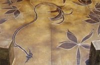
The goal in the bathrooms was to create a retreat-type feel that was welcoming, fun and a little bit classy. Diane Bendele was the artist for the men’s bathroom. To begin, she drew a layout of the room on paper. “The fish theme seemed like a fun and playful idea,” she says. “There would be many different sizes and shapes of fish. Some fish are seen from the side, others are seen in three-quarters view with their tail curving and flipping towards the viewer, and others are seen from above. I remembered the fish I had seen at Shedd Aquarium, Monterey Bay Aquarium and Newport Aquarium.”
This was Diane’s first experience with using stains on concrete, so some preliminary testing with porosity and color development was done in an area where a cabinet was to be installed. Diane had recently been working on expressing movement and motion with watercolors on canvas, so this idea was incorporated into the seaweed and kelp. Colored pencils close to the color of the stain were also used to plan out the designs and shapes. The pencil mark could easily be erased if something needed to be changed.
For the staining process, Diane poured a small amount of the stain into a disposable muffin tin. In some of the tins, two or more colors were mixed to get the desired color.
She dipped a small foam brush into the translucent concrete stain to brush it onto the concrete. It gave a deep color, similar to acrylic paint. Other times she loaded two or more colors onto the brush by dipping one corner of the brush into one color and the other corner into another. When applied to the concrete floor, the two colors blended in the middle.
This artwork and floor were then sealed with a single-component urethane finish for its UV stability and to protect the stains from fading.
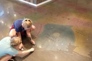
The remainder of the floor in the space, including the main gallery, would have greater movement. The detail and design had to be proportionally scaled to the space as a whole. For the color in this space, acetone-based dyes were swirled, flowed and intertwined throughout the entire gallery and hallway.
To spray the colors, we created an outline by spraying lines on the concrete, then filled in spaces. This was done on-site with Hope Wallace and myself dictating where the colors would look best.
To soften the color transition between the vibrant dyes, we added a diluted brown water-based dye to the concrete densifier. This floor was polished to a highly reflective 800-grit finish.
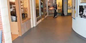
The LED track lighting really brings out the overall shine of the floor. The color in the concrete looks like it is inches deep in the surface.
Looking across the floor provides different views of the movement throughout. Because of the size of the space, you cannot see the color or movement on the other side of the room. When looking at the floor from another vantage point, new parts of the floor will become apparent.
Great designers and artist have a way at looking at things differently. They have almost a supernatural ability to see the potential of a space, to see beyond the current state and to imagine what could be. These artists are gifted in creating, changing and impacting the world with their ideas and dreams. This was just the case in Van Wert, Ohio, as a historic National Guard Armory Building more than 70 years old was transformed into the heart of the region for the arts and creativity.
Project at a Glance
Client: Wassenberg Community Art Center, Van Wert, Ohio
Contractor: Dancer Concrete Design, Fort Wayne, Ind. | www.nickdancerconcrete.com
Scope of project: 8,000 total square feet of polished and colored concrete flooring in a building with concrete dating from 1938
Products used on polished concrete flooring: Lavina 32 Pro polisher, CDCLarue vacuums, ColorTru dyes in Slate Blue and Caramel from Spectru Systems, Lythic Densifier with added Lythic Duet Colors dye in Buckskin, RetroGuard sealer from Advanced Floor Products LLC
Products used on stained concrete floors: Butterfield Color Elements Transparent Concrete Stains, SuperThane sealer from Wayne Products
