There is a famous paperback called “The Elements of Style” by Strunk and White. Many writers treasure it as a guide to writing clearly and succinctly while avoiding common grammatical errors. The handbook itself is a model of clarity.
I had 26 years of studio work and art classes behind me as a fine arts painter when I gave up in disgust at the ploys involved in marketing art. In comparison with the world of galleries and critics, what contractors asked me to produce on floors came as a refreshing whiff of common sense.
Fifteen years later, I decided to teach some principles of design and composition to my contractor-students. Having some knowledge of the way artists think about filling space truly helps in choosing materials and structure. Therefore, I undertake this series of articles to present the Elements of Style for Contractors.
If you take a line and loop it back on itself, you will have a shape. A shape can be two-dimensional on a flat surface or three-dimensional in sculptural form.
Artists divide possible shapes into two general categories: geometric and organic. Geometric shapes — circles, ovals, squares, triangles — are often used in engineering and construction because they can be easily sketched with a ruler and compass and combined for endless geometric patterns and formats. Organic shapes are most often found in nature (see above). They are often irregular, like the broken slabs along the border of a sulfurous hot spring or the lichen found on some beach pebbles.
If you’ve ever looked out a plane’s window at a river below, you may have noticed how the branching shape of its tributaries on a macro scale mimics the growth pattern of a single leaf’s veins on a micro scale. Scientists are exploring these coincidences and detailing the reasons for them. Their explanation is that no matter their size or scale all growing things are subject to the same physical laws of pressure, packing, stress and flow.

Peter S. Stevens’ 1974 book Patterns in Nature is one of my favorites on this topic. Another great source is Nathan Cabot Hale’s 1993 book, Abstractions in Art and Nature. In Hales’ book, he explains how the shapes in this wood burl grew to closely resemble the flow patterns of moving water.
The grid pattern and symmetry
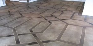
The most common human-imposed design is the grid. Most city streets are laid out in grids and, because it’s so easy to manufacture hundreds of blocks from the same mold, most floors or walls have a grid pattern. Aside from the grid, the most frequent design I see on concrete floors is the “compass rose.” This is a rather clumsy design of long, pointed triangles placed four-square within a circle. A current favorite with floor designers, the compass can be plain or elaborate.
Let’s take a detour from grids and quadrilateral symmetry and turn to nature for relief from our built environment. In contrast to the rectilinear shapes of the rooms we are hired to enhance, designs inspired by nature can give us variety.
One example is a design done by a Floric Chroma-Tech Stain representative. It is fairly geometric, with its concentric circles and parallel bands, but some wavy riverine forms are woven in and out
of the geometry (at varied scale) to lend an element of surprise. This creates the illusion of movement, which a completely symmetrical and centered design, like a compass rose, cannot do. Perfect symmetry appeals to architects and builders, since it feels firm and stable, but artists often shun it because they consider it static.
Balance, emphasis and unity
Rick Lobdell’s floor at the DelMonaco Winery & Vineyards in Baxter, Tennessee, featured in the July 2011 issue of Concrete Decor, is another example of fine floor design. Lobdell needed a design that could surround the company logo in the center and cover about 6,500 square feet.
For design inspiration, he says, “I took long walks through the vineyard and analyzed how a vine grows, how it wraps around the trellis, and how large a leaf was in comparison to the size of the vine itself. I created walkways around the main room and through the rest of the building with the trellises.” This allowed him to get creative with how the vines, trellises and leaves, which are about 3-by-4 feet in size, interacted with each other.

Trained artists like Lobdell keep some important “principles of good composition” in mind while working out a design. Let’s divide this floor in a way that’s harmonious, but also has balance, emphasis and unity.
The floor colors are harmonious. The long straight trellises initially look like an ordinary dark border detail, but they are shaped at intervals to suggest bamboo poles. If Lobdell had used curving vines alone, the design might have looked as if it were wandering off in all directions. The straight trellis provides a stable geometric skeleton, as well as a pleasing contrast with the flowing vine and leaf shapes (that makes for ‘emphasis’). The golden edges around each trellis, vine and leaf emphasize each shape and, by being the same width, unify the whole design.
Positive and negative shapes
Artists also are aware of “positive and negative shapes.” Positive shapes are usually considered the foreground objects and the space around them is the background, or “negative shapes.” Negative shapes are given equal consideration as the shapes formed by the spaces around the positive objects in the foreground.
Try to draw a tree in winter against a snowy background. You’ll find it’s just as important to get the shapes of the spaces between the limbs right as it is to color the branches dark enough to correctly portray width. In fact, by thinking of the tree form as a silhouette and concentrating on the white spaces, you’ll draw faster and be more accurate than if you get caught up in drawing the tangle of positive shapes formed by the limbs.
In looking at Lobdell’s winery design you can see he didn’t try to recreate the actual sizes of a vine and trellis, but simplified and abstracted them. Notice the background spaces between the vine and trellis shapes are in balance with each other, harmonious and varied. The positive and negative shapes work well with each other and the size of the furnishings, so no one part of the room design looks like an afterthought. That makes for an effective design!


