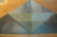
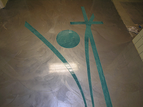
I love color. Bright, vibrant, fun colors that pop. Deep, rich tones that soothe. Soft, gentle tones with minimal contrast. But thinking about color always leads me to texture, mottling, layering, variegation or marbling. I cannot think of even one instance when I would want a paintlike solid color on one of my projects. To me, color and depth go hand in hand.
Fortunately, that is the nature of concrete and the beauty of decorative concrete in particular. I often say that it is the anomalies inherent in concrete that are the most outstanding.
This leaves us, however, with the very real problem of conveying our passion to a public that has little to no experience with the possibilities available to them outside of the most common of decorative concrete finishes.
When explaining the possibilities to customers, I tend to break color options down into three categories and then design the application to suit:
1) Movement: This is the ways the highs and lows separate from one another. Do they fade into each other or are there crisp delineations? Organic mottling or veins? Arches or slate shapes?
2) Contrast: Are the highs and lows subtle or extreme? Are the tones one color or multiple colors?
3) Texture: A project can have the appearance of texture but be smooth, or it may call for actual texture, subtle or extreme.
Once these three categories have been addressed, I have a very good idea of what the client expects. The client may, for instance, want a smooth floor in blue gray and medium gray tones with minimal contrast and the movement to be “slatey” in nature.
Great! Now we have a concept and, if the client would allow, we’d be tempted to move forward. But keep in mind, although you do this every day, the description you’ve agreed on is still very subjective. Consider, for instance, how many shades of gray there are in a Sherwin-Williams fan deck. The client’s visualization of these terms may still differ, sometimes greatly, from yours or mine. Then there are those who will simply not be able to visualize it until they see it.
So regardless of how sure you, and even they, may be that you are on the same page, always create a carefully measured and documented sample.
Also, be realistic about what you can do in the shop on a sample board and what you can do in the actual conditions of the actual site and on a large scale. We are often working not only with specific pigments, but with percentages of white and gray cements and pozzalans that may change in hue or even color from one manufacturer to another. Gray cement changes in particular.


