When New Leaf Community Markets decided to construct a new 20,000-square-foot location in Santa Cruz, Calif., the flooring was one feature the company wanted to be unique, durable and representative of the beach community in which the natural food store would be located.
“For this floor we wanted to do something sculptural,” says New Leaf creative director Sarah Miles.
To achieve a floor that reflected Santa Cruz’s ocean-oriented west side while also being relatively inexpensive to create, Miles and project manager Steve Crocker turned to Bay Area-based concrete artist Mike Miller and his firm, The Concretist.
By utilizing sail-shaped stamps, differential curing, some basic construction materials and a sweat finish, Miller crafted a colorful ocean-themed floor that fit the bill.
“He created a presence that you normally don’t get in a floor,” says Crocker, of CDM Real Estate Co., based in Watsonville, Calif. “It’s multilayered and complex.”
Design for the market’s floor began during summer 2008, when Miller, Crocker, Miles and other members of the design team sat down and decided the core identity of the store’s interior would revolve around pier and sailing ship themes.
“Our plan was to do as much as possible in the original concrete pours – there wouldn’t be any applied colors or graphics, just grey concrete,” Miller says. The concrete was later stained a pine wood color at the request of New Leaf.
Because New Leaf was on a shoestring budget, Crocker referred Miller to a design style inspired by Samuel Mockbee’s Rural Studio that emphasizes basic, inexpensive construction materials.
Miller and his partner, Kelley Burnham, combined this design style with the pier and ship sail themes and produced renderings that met with design team approval. “We created both simple (two-dimensional) and more complex (three-dimensional, in perspective, with a vanishing point over an exaggerated horizon) versions of looking at a pier,” Miller says. “It’s a graphic element that moves you through the store.” Inexpensive construction materials were used generously when it came to the design of the ship sail stamps, which would be pressed into the fresh concrete throughout the left-hand side of the market.
“We didn’t want to use traditional stamps that were simulated brick, cobble or wood plank,” Miller says. The sail stamps were constructed of burlap, duct tape, bamboo and redwood battens by Burnham and seamstress Emily McClintick.

Initially the first concrete pour, within the shopping area of the market, was set to occur in early fall 2008. However, this pour was pushed back, and Miller instead completed several test areas in the back part of the market, which included restrooms and a demonstration kitchen. These test areas were key to the project’s success, as they gave Miller the opportunity to sample texture, stamping and curing techniques that would be used frequently during the project.

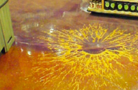
The restrooms represented the first test area. It was there Miller focused on achieving a concrete surface that when completed, resembled an open, windblown ocean full of waves and whitecaps. This ocean look was achieved through a sweat finish used on parts of the floor during the final troweling. Miller explains: Typically during the second pass of concrete trowel finishing, a lot of pressure is applied on the concrete surface to ensure its smoothness. In a sweat finish, rather than applying the trowel at an angle with force, the trowel is laid flat, allowed to float, and is moved around in a radial sweeping motion. “It creates a suction, and it slightly lifts the cement paste in a swervy way,” Miller says.
The second test area was the demonstration kitchen, where Miller placed the sail stamps in the fresh concrete during the second trowel pass and removed them the next day. “He took advantage of a step that most would overlook,” Crocker says. A challenge during the sail stamping was determining the best time to apply the sail to the concrete, as applying at the wrong time could result in an impression that was too deep.
“When it was too deep we filled it in with a clear epoxy resin,” Miller says.

In an attempt to differentiate the colors of some of the sails from the rest of the slab, Miller applied a water-based acrylic sealer to the portions of concrete that were not textured by the sail stamp. Thanks to the sealer, the sail-imprinted portions of the concrete were able to hold in a different amount of moisture, when curing, than the rest of the slab. As a result, these portions ended up a different color. Miller completed the sails with a combination of applied and impressed finishes and colors that included Colormaker Patinaetch stains, Deso Dyes and Aquacolor tints.
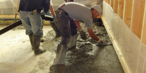
Then, Santa Cruz subcontractor Coast Concrete began placing the concrete slabs during late fall 2008. Five main sections of concrete were placed, beginning with the left-hand side of the market, which included the sail compositions.
Because a significant amount of Miller’s work took place on fresh concrete, Coast Concrete had to work with him throughout the pouring, says John Cureton, owner of Coast Concrete. What made Miller’s work unique was the use of novel construction materials and different embeds, he notes.
The sail-stamping methods utilized in the demonstration kitchen were replicated during the first pour. Miller also engaged metalworker Brian Giambastiani to produce plasma-cut steel templates of stylized sail images and pier images, which were then sandblasted into the concrete to create graphics similar to the wavy reflection of a sail on water and piers in a sandy beach.
During the second placement near the slab with the sails, Miller used bamboo fencing that was cut into cloudy-textured graphics and rolled on top of the hard yet still-green concrete. He was able to create larger images that showcased the fine details of each piece of bamboo. “I think a lot of people on the project were wondering, “What are they doing?” says Miles of New Leaf.
The bamboo sheets were not pressed into the concrete. Rather, they sat on top of the slab for 10 days and were weighed down in various spots to promote differential curing, which brought out the details of the bamboo and created color variations. “That was the first time we’ve done that,” Miller says.
The third and fourth pours took place in the center and right-hand, back portion of the store, and both featured a pier theme. In order to achieve the look of pier pilings, similar to what is seen at a Santa Cruz wharf, Miller placed circular, plasma-cut steel templates onto the concrete and sandblasted the field.
Miller also blocked out circles that would represent pier pilings and be filled with jellybean glass. Glass was seeded at the right entry of the store and exposed through washing. Different colors of tumbled glass were scattered into the concrete throughout the store to suggest sand on a beach.
The market’s exterior pour was the last of the five pours. Miller was generally satisfied with the project. The sail stamps and templates will not be reused, but that’s no loss – using nontraditional materials and discovering new techniques drive Miller as a “concretist.”
“Our business is not based on creating a system and repeating it,” he says.
www.theconcretist.com
Project at a Glance
Scope of work: Floor for new natural foods store
Store owner: New Leaf Community Markets, Santa Cruz, Calif.
Decorative concrete contractor: The Concretist, Benicia, Calif.
Project manager: Steve Crocker, CDM Real Estate Co., Watsonville, Calif.
Creative director: Sarah Miles, New Leaf Community Markets
Concrete placement: Coast Concrete, Santa Cruz, Calif.
