I remember seeing the coolest home I’d ever seen, on the cover of a Sunset magazine. It was a tiny, 600-square-foot, colorful constructivist number set against the huge raw mountains of a river valley. And it was chosen Sunset’s “Home of The Year.” I remember it was in Yakima, Wash., (a place I had not yet been) and I remember it was designed by architects Miller-Hull (a name I was not yet familiar with). A few years later I got a call from Marin County interior designer Sharon Campbell, asking me if I’d like to be involved in a project near Yakima. “That’s funny,” I said. “One of my favorite projects is in Yakima … a place by Miller-Hull. I saw it in Sunset.”
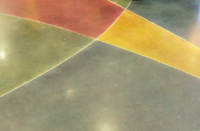
“I know the house,” said Sharon. “This one will also be by Miller-Hull, and it will be for my husband Craig and I.” So I was hired to stain Sharon and Craig’s cast-in-place slab, interior floors and exterior patio, and to try to capture the essence of the site’s basalt columns and natural grasses. I’ll never forget the late fall foliage of the apple orchards, and I’ll never forget Sharon and I dropping dye on the slab through pipettes, in bright yellows, scarlets, oranges and greens, attempting to stylize the surrounding lichens and wildflowers. All this while my dad (who was helping) complained about the damn wind.
Town and country: The Campbell residences
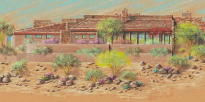
Sharon Campbell and I actually talked about two of her and her partner Craig’s homes, their primary residence in Seattle and their weekend home set amongst the orchards, east of the Cascades and just west of Yakima. Sharon is an interior and furniture designer who teamed up with the Northwest modernist architects of Miller-Hull and general contractor VK Powell Construction on both projects.
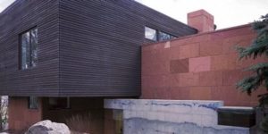
Their first project was the weekend home, in Naches, Wash. It was small. It was simple. It was lyrical, like a haiku. Sharon made the decision to limit the intersections and confine the planes of materials. If a wall was wood, it was wood inside and out. If a wall was exposed concrete, it was concrete up and down, from the first story through the ceiling, through the second story and up to the roof. Yellow was yellow inside and out and red was red up and down. The floor and patio were concrete inside and out, with a leathery sweat finish, stained brown, like the local basalt palisades or an old-timer’s weathered saddle. It was lightly peppered with iron spots and small coppery floral bursts. All horizontals were continuous. The slab and the hills were one.
Their second project was the larger and more complex Seattle home. Sharon has said: “I wear my architecture.” Sometimes jeans and cotton with a few accessories are just right, and sometimes something more is in order. According to Sharon, there are more than 60 colors in the palette of the Seattle home. She really pushed the compositional envelope, exploring a broad range of materials and their qualities. Qualities such as gravity (heavy concrete and blued steel walls and floors) and buoyancy (light, transparent glass, colorful mosaic art floors and whimsically painted walls, including sketches and the painter’s editorial comments).
When I first asked Sharon why she liked to work with concrete, she stated, “It’s about the surprise!” Part of what’s so great about concrete is wanting to see where it takes you. Sharon formulated a floor concept, believed and was ready to let go. She asked general contractor VK Powell to not protect the floors during framing. Powell was conscientious and so, of course, refused. You’ve never seen a floor protected until you’ve seen a VK Powell job. When we arrived to stain, we were presented with a lovely concrete slab in great shape – and Sharon was upset.
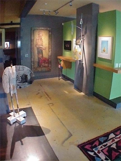
I located some sharp, rough plasma-cut chunks of scrap steel beams and suggested distressing the concrete with them. Sharon was elated. She provided further art direction, including complete color and material references, and gave the nod to hack away. After beating the crap out of the slab, we hand-colored and worked it to resemble an ancient crumbling fresco or a fragment of worn papyrus or something like that. A historical connection! I also remember that I was mad at my mechanic that morning and felt a whole lot better after whacking the slab. Sharon liked the result and suggested I tip my mechanic.
In the wine country: The Jones-Roche residence
Our crew arrived early at the Jones-Roche house in the California wine country that morning and began preparing for the impending pour. We worked furiously, masking the interior walls, placing wire mesh and reinforcement, laying out tarps, canvas and paper to protect plants and hardscape, fielding numerous phone calls, knowing we had no choice but to be ready when the truck arrived. Wait, where’s the wheelbarrow? Didn’t anyone bring a wheelbarrow? If the pump breaks down or the hose clogs, you’d better have one handy. Send someone down the mountain to get one. I hope it gets here before the concrete does.
Our lead finisher (Eddie Gray, concrete technician extraordinaire out of Las Vegas, Nev.) arrived, fresh from the airport. He shuffled through the house, mumbled a few things, then quietly sat down outside and removed his shoes. He pulled on his rubber boots with deliberation, and sat calmly, watching us frantically prepare.
And then the concrete arrived. Ed nearly leaped out of his boots and began furiously directing the crew. In came the hose, and the mud flew. A few hours later, there it was. . . a beautifully finished living-room floor. Eddie shuffled into the house, grabbed a well-deserved Budweiser, and slumped down on the kitchen steps. He didn’t budge, or say a word, until two empty cans lay at his feet . . . and the pump did break down, but not until the last bit of mud was placed.
Malcolm Jones and Karen Roche are partners with a passion for art. Their home, near the line between Napa and Sonoma counties, Calif., is a unique one, straddling a high mountain ridge and designed in the spirit of a Native American hogan. It is gear-shaped, with the hearth at the center of the structure. All other spatial and structural elements radiate from there.
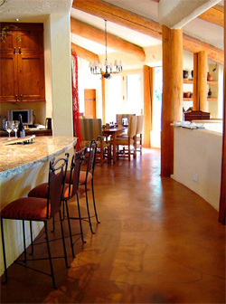
The primary structure is comprised of huge exposed logs, and the home features “geological” hand-wrought concrete floors. There are no right angles anywhere, and space expands from the hearth to the outdoors, where the architecturally treated concrete patio and the landscape perpetuate the expanding radii. Precast concrete counters and sink grace the powder room, and soon, concrete art panels (commissioned to concrete artist Martin Webb) will hang along an outdoor dining area.
When Malcolm and Karen first bought the home, there were a couple of problems. The sunken living room, bridging the interior of the home and the outdoors, never got a finished floor. Also, they loved the integrally colored and hand-painted concrete floors throughout the rest of the house, but weren’t crazy about the pink color. “We talked with concrete people for a year,” says Malcolm. “We learned a lot about concrete! We wanted to shift the color of the original slab without losing the original artwork.” Additionally, Malcolm and Karen wanted a finished concrete floor for the living room. They called on The Concretist to help them with both issues. They were excited about the possibilities.

They appreciated that concrete could be manipulated but that it also does its own thing. They were also intrigued by the idea of the living-room floor as a piece of original art. “We were excited about a fresh palette,” says Malcolm, “and wanted to transition the outside to the inside, with both color and design, without replicating either.” The result was a warm, leathery floor. The subtle design was a bridge between the organic hand-worked qualities of the original interior and the tighter “architectural” style of the concrete hardscape. It remained sympathetic to the “native spirit” of the home.
Malcolm and Karen were well prepared for their concrete adventure. Karen felt that using conventional materials in their home would be not only less interesting, but also practically difficult, due to its curvature and lack of right angles. The couple likes what they refer to as the “living nature” of the material. “I think it continues to evolve over time,” says Malcolm. “I think it continues to cure and therefore change. It also evolves over the course of the day, depending on the direction of light and where you stand. Just seeing it from a different angle changes it.”
They also understood that there could be no assurances that the thin slab topping (1 1/2-inch, concrete over concrete) wouldn’t crack, and were willing to embrace other imperfections as natural and unique. They let go, and are pleased with the outcome. They recognize, however, that many people would probably have trouble with the capricious nature of concrete. “It’s a concept, as opposed to an actual finish. It’s like allowing a painter to paint whatever they want. You have to trust in the concept and the execution,” says Karen. And in each other and concrete we trust!
