There is a famous paperback called “The Elements of Style” by Strunk and White. Many writers treasure it as a guide to writing clearly and succinctly while avoiding common grammatical errors. The handbook itself is a model of clarity.

I had 26 years of studio work and art classes behind me as a fine arts painter when I gave up in disgust at the ploys involved in marketing art. In comparison with the world of galleries and critics, what contractors asked me to produce on floors came as a refreshing whiff of common sense.
Fifteen years later, I decided to teach some principles of design and composition to my contractor-students. Having some knowledge of the way artists think about filling space truly helps in choosing materials and structure. Therefore, I undertake this series of articles to present the Elements of Style for Contractors.
Artists approach design as a space-filling exercise. As such, the first thing they consider is the format within which they will be working. Is the given space a long rectangle or is it circular? The shape of the format will radically alter the distribution of elements within it. The elements of design are the simple building blocks artists have to work with, such as line, shape, texture, value and color. In this series of articles, we will explore these elements and how they apply to concrete work.
The artist’s first plan is usually to sketch out the composition he or she will make within the format. The composition is the artist’s choice of design elements and the way they are arranged in space. There are some principles of “good composition” which all artists either learn in school or instinctively understand. In dividing up an empty space we want to create a harmonious use of space division, balance, unity and emphasis. We also want to carry the viewer’s eye around the space in a way which feels natural and pleasing.
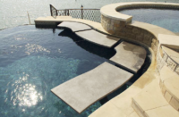
This pool patio (above) by Troy Lemon of Cornerstone Decorative Concrete uses crisp white borders to frame the larger stamped flagstone elements, the way white cuffs emphasize a dark dinner jacket (space division and emphasis). He creates unity across the whole patio by maintaining a shallow stamped texture over every portion of it. The wider white border is in proportion to the larger size of the pool. If there were only a border around the pool, and not around the walkway, the composition would not be in balance.
We usually do not want our work to look unbalanced, disjointed or confusing. Artists might strive for a disjointed feeling if portraying war or agony, but this implies they know the rules of harmony well enough to break them in the service of a powerful impact.
There is some cultural relativity to the rules of good composition. We Americans are conditioned by a lifetime of reading English. Our eyes scan a painting or photo by entering it from the left, as we do a page of script. Then it is up to the artist to lead the viewer’s eye around the format, trying to keep attention moving within the frame.
One must not create some bright-colored anomaly in one corner upon which the viewer might fixate. (That is called an “eye trap.”) You also do not want the viewer to glance briefly at a central image and then leave the canvas, feeling there is nothing more of value to see. In general, the entire composition must be treated with care and detail equal to that of the center of interest.
Tony Richardson, a professional photographer, took this shot of one of our crew members while she was applying muriatic acid to a long piece of felt we had put down to etch a petroglyph (the electric company’s logo) onto the floor of the utility provider’s skybox at the baseball stadium.
Notice how your eye enters the photo following the wall on the left, then travels around the image in a clockwise movement, staying within the format and following the lines of the logo to arrive at the emphasis (the person working). The distortion of horizontal lines by Richardson’s wide-angle lens curves the entire room to create a unity with the floor design. This is an example of inspired composition.
Summary: The way design elements are used to fill a space involve four “principles of composition” (space division, balance, unity and emphasis). These are your guides to planning and action. The five elements of design are the tools you use to bring your design to life.


