“There are different ways to draw attention to features without being demanding. You want people to walk on a job and notice the concrete as an enhanced feature of the overall project, but you don’t want them to gawk,” says Lee Levig, owner of Concrete Works in the San Francisco area. “If they immediately look down, you’ve failed.”
Doug Carlton, who heads up Carlton Concrete in Visalia, Calif., agrees. When he first started out and was trying to make a name for himself, he wanted each of his projects to stand out. “That’s a pitfall that many contractors fall into,” he says. “That’s not the point of it. You want it to blend in. The whole goal of a decorative sidewalk [for instance] is to enhance the natural look of the landscape with an organic piece of art.”
In the past, most people viewed a sidewalk as a whitish expanse of pavement that created a way to get from the street to the house, Carlton continues. Today, they still want it to serve the same purpose, but “Many want their walkways to be camouflaged to look like a natural surface, to look like it’s part of the landscape.”
Like feng shui, which stimulates the senses, “Concrete should flow with the overall feel,” Levig says. “You know, when you walk into a place or up to a place and it feels right … that’s what you’re trying to go for.”
The drawing of the eye
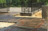
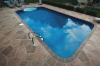
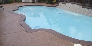
One of the most prominent ways to draw an eye to a specific focal point, such as the front entrance, is to use a border along the walkway leading to the door. The front porch often has a border around it, too, tying the two elements together.
Another technique, Levig says, involves cutting control joints on the walkway on a 45-degree angle to the house. “This forms a series of diamonds, with every diamond centered to the front door. It’s like drawing an arrow to the front door.” This configuration, too, can be accented with a border.
Carlton, whose work has been featured on television’s “Extreme Makeover: Home Edition,” says you can also take a design on the house and extend it out to draw the eye in. By deeply scoring the concrete, for example, he created a driveway whose design was an extension of the grid pattern found on the garage door. “It almost looked like a sunburst design,” he says, as the score lines got farther and farther apart down the driveway.
Gary Jones, president of Colormaker Floors in Vancouver, B.C., says to attract the eye he likes to do designs that mimic a feature of a house, such as an art deco design that may be in the front door’s glass, by transferring that design to the entranceway. Most designs can be done with saw cuts, he says.
For commercial applications, footprints may be used to lead the eye and the consumer to the front door, says Darrel Adamson, president of Engrave-A-Crete in Bradenton, Fla., a company that manufactures and markets tools and templates to engrave concrete. He’s seen this technique used in various innovative ways, including a combination of animal prints leading to a kids’ section in a library.
Along this same line, Jones associate Mike Miller recently used fish imprints to lead customers in a Whole Foods store to the seafood section. He bought some salmon, sliced them in half and laid them in freshly poured concrete, even going so far as to arrange some of the fish so that they looked like they were swimming up the stairs.
Floored with designs
When it comes to trying to decide on decorative patterns for interior floors, “The house will tell you what it needs if you let it,” Levig says. “If it’s contemporary, keep the design clean and simple. If it’s Tuscan, use antique colors. Just look at the overall theme and stay inside those parameters.” He also suggests using neutral colors for longevity’s sake because people’s tastes tend to change and evolve through the years.
Carlton thinks that designing interior floors is much tougher than outside surfaces because there are so many directions you can go. “We usually start by showing the homeowner pictures of completed projects to see if we have done something that they can visualize in their own home.” Typically, he narrows it down to three or four projects, a number that works for him. “There’s no reason to overcomplicate the job and give them too many to choose from,” he says.
Rather than wanting to mimic a shape found elsewhere in the room, a technique commonly employed, Carlton says many of his customers opt to incorporate a favorite piece of furniture or some other furnishing into a floor design. For instance, in a dining room, he’ll often do a contour around the table. In a kitchen, he’ll do a band of color around an island and perhaps another band that runs parallel to the cabinetry. In a couple of cases, he’s duplicated the texture of distressed leather furniture on the floor.
Jones says he likes to use saw cuts to pull you into a house or business and direct you to a preconceived destination. “And the cuts don’t have to be straight lines,” he emphasizes. “They can be wavy. Straight lines tend to be harsh and they make you feel tense.”
Keep in mind that when you resurface a floor with concrete, it’s like a blank canvas. “You don’t have to mimic 12-by-12-inch tiles or put in 24-by-24 saw-cut lines to re-establish the look of the tile that had been there,” says Jones, who is a big fan of Wassily Kandinsky, a Russian-born artist who many consider the father of abstract art.
“Concrete allows you to create different feelings in a house by using different shapes and designs. Use your imagination. Use circles. Be creative. A checkerboard pattern makes you feel enclosed, where amoeba-type shapes will make you feel more relaxed,” Jones points out.
And don’t be overly concerned with putting in expansion joints, he asserts. “I’ve done 20-by-15-foot rooms that didn’t have one saw cut for expansion. There’s no real need. Concrete is going to crack where it wants to crack. Cracks are our friends. They may bother some people, but they don’t bother me.”
Stay in control
Cracks do bother Carlton and he asserts that control joints are a necessity of concrete. “But they’ll stand out like a sore thumb if you don’t incorporate them into the design,” he says.
“If you have to put a score line in that will mess up your design, it’s best instead to put two control lines in that are 12 to 18 inches apart, and make an accent band in your decorative work. It’s a win-win situation. It gives the decorative concrete more of an organic or natural look, and you can charge more money for the details. It gives the crew a good stop-and-start point, too.”
Levig says when you’re getting ready to design a slab, the first thing you need to do is figure out where you have to cut a joint. “We call these ‘mandatories’ and we design around them. For instance, if you have two columns on the front porch that have an18-inch base and are 6 feet away from the front door, you know when the concrete dries, it shrinks away from the columns and cracks. So you cut a control joint off the corners to isolate the columns and frame them. This frame becomes a functional part of the art.
“The Romans thought of this long before I was alive,” Levig continues. “So did the English and the Moors. Borders were an essential part of design. What I’m trying to say is that you don’t have to reinvent the wheel. Just pay attention to what’s around you.”
Now design this
To determine the decorative design, Carlton says the contractors and architects his company works with are more than happy for him to jump in to deal with the homeowners directly. “If it’s a stamp job, we’ll do a 30-minute to a two-hour tour of decorative concrete projects we’ve done,” he says. “This way we make sure they get exactly what they want.” During this “home tour,” the homeowners get to see jobs that have been in place for some time, not freshly done jobs that haven’t aged. “They usually like one of the first things they see,” he says.
Levig, on the other hand, prefers to work out a design with the contractor, interior designer or architect, who then presents the options to the client. The biggest factor he’s concerned about, he says, is coming up with a design that’s within budget.
Somewhere in the middle, Jones likes to meet with all parties concerned. “We work alongside the contractor and owners and their designers to come up with ideas together,” he says.
Both Levig and Carlton say they often work side by side with landscape architects in the design process. “They’ve done 90 percent of that front work,” Carlton says. “We get a lot of direction from them. We used to shy away from those guys but they are our No. 1 allies. They can create work for you, and that’s what you need in this business. It’s not enough for homeowners to decide they want decorative work, you need people to suggest it, too.”
Making the transfer
If the design isn’t a simple geometric design, how do the pros transfer it to the floor?
Carlton says he uses chalk. “Before the crew shows up, we have a chalker. We completely lay out all the contours and designs and draw in all the score lines. Then we take digital pictures and give them to the crew leader.
“We’ve tried water hoses and PVC pipe but chalk is the best and most inexpensive way I’ve found [for design work],” Carlton says. If the client wants to make changes, the chalk is easy to rub out and alterations can be made before the crew shows up for work. “It’s more costly to move forms,” he says.
Adamson, whose company works closely with contractors, strongly believes in using templates to create complex designs. “The contractor sends us a likeness and we make a template from that,” he says. Engrave-A-Crete’s templates are made of a half-inch thick plastic material that can be used over and over.
His company also has a variety of tools that are used to engrave concrete. They can be used to produce patterns from simple brick to more complex circular ones.
Getting away from square tiles
Jones often uses PVC pipe to help him draw curves and “create big swirls.” He also is big on using “found objects,” from the halved fish mentioned earlier to paddles, leaves, torn paper and even piles of sawdust.
Just like his inspiration, the artist Kandinsky, Jones’ designs are often a conglomeration of layers of colors and shapes. To achieve his designs, he covers the area two, three or four times. “On day one, we’ll put a square on two thirds of the room in one color. The next day we’ll put a circle on part of that in another color. The next day it’ll be a triangle in yet another color coming in from a different angle,” he cites as an example. In between these layers, he sands and smoothes the floor to achieve varying textures. “The transition between colors is vital to the overall design,” he emphasizes.
With his technique, the various shapes take the colors differently because the thickness is different. In the end, “You can almost see through the concrete layers like Venetian plaster. But it’s very subtle. You really have to look at it to see the different colors.”
During this process, he also sometimes employs piles of sawdust. “We’ll take clumps of sawdust and randomly place them on the floor before we spray a color. The next day, we’ll vacuum up the dust. Beneath it, that area didn’t get any of that particular color.” The process is repeated elsewhere during the subsequent layers. Sometimes, he says, they seal some areas and not others during the layering process to create visual images. “They’re very simple techniques really,” he admits, but the results can be stunning. “People used to think of floors as something you just walk on. There’s no reason they can’t be a piece of artwork.”
