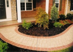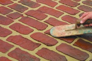
I’ve always appreciated the craft of concrete stamping and the work ethic and skill of a really good stamper. However, I’ve never quite understood why anyone would choose decorative concrete trying to look like used brick, or trying to look like ashlar slate or tumbled marble, when you could choose brick, slate or marble. Isn’t it better to be as honest and genuine as possible, in every way?
Why would anyone spend thousands of dollars on Parisian cobblestone stamps? A flight to Paris and a hotel for the weekend, for both concrete contractor and client to share mutual experiences and gather ideas, would’ve been cheaper and the real deal! Isn’t it better to sample the red wine and French bread and read Colette on the actual Champs-Elysees? And, isn’t it better to choose concrete trying to be… well, concrete?
In response to a faux approach (like traditional stamped concrete) or an overly structured approach (architectural concrete), my co-principal, Kelley Burnham, coined the phrase “sensory concrete” to describe a product that embraces the innate qualities of concrete as well as the sweat and skill that helped create it. According to Kelley, sensory concrete focuses on tapping the energy endemic to concrete design and construction, revealing and interpreting its magic.
One of my goals is to always give the material a voice. I do this by utilizing my senses. I touch. I look long and hard, looking for nuances that may not be apparent at first glance, such as the ghost of aggregates near, but just below, the surface. I’m a bit of a concrete Buddhist. I try to see what’s genuine. Take a close look at concrete, and acknowledge what it really is, not what you’d like it to be. Concrete is an imperfect yet beautiful material. It sometimes seems that the harder you try to make it consistent, the less that happens. Consider looking at all “the bad things” and emphasizing those more naturally occurring and dynamic aspects.

The new school
Not only does concrete offer its own unique qualities and inconsistencies, its relationships with its environment and other materials offer opportunities as well. Take the example of a sidewalk being finished on a shady lane, on a blustery fall day.
The finishers cuss as again and again leaves are blown onto the wet concrete. Some are removed and some are missed, and those are then finished into the mud. Voila! You have beautiful leaf fossils. At least, you hope that the owner looks at it this way! This was an error on this project, but how might it be used in the future to your advantage?
When I was with L.M. Scofield Co., I was often called out to look at color projects that had gone awry. Every year, there was at least one project where the client claimed that our color was no good, where the concrete had developed a case of “the measles.” I’d go. I’d look. Was there a lawn adjacent to the concrete? Had the owner recently fertilized?
Ah, with Ironite granules…Voila! Sporadic rust-colored spots had permanently stained the integrally colored concrete. It didn’t look so good here, but how about on a variegated stain job? It might add a bit of a wormholey, travertinesque quality, or something a bit like knots in wood. Hmmm?
 A case study
We recently recreated this “comedy of errors” on purpose for the wine cellar of a 15,000-square-foot residence north of Truckee, Calif., in the Sierra Nevada mountains.
Kelley and I collected grape leaves, which were cast and sweat-finished into the concrete paving. Later, we’ll stain and sporadically spot the concrete with iron-rich fertilizer granules. These spots should suggest something reminiscent of loose and bunched grapes. Not a bad start for the floor of a cellar and tasting room.

Just outside of the cellar was a hall. The architect, Dennis Zirbel, suggested an old-world streetscape feel. (Ultimately, it would be sanded and stained like the wine cellar.) Kelley and I offered up natural gray concrete, lightly stamped with seamless slate texture mats, with noncoloring mineral spirits as a release agent. This surface would be subsequently stamped with a warehouse full of one-off, unmatched texture mats cut into random rock shapes. There would be plenty of space in between the mats, and nothing was to line up just right. “Impossible!” said the architect. “No street would ever look just like that! And the individual stones will appear embossed.” That’s right, Dennis…no street would ever look like that, but a whole lot of them would feel that way. What you asked for was an old-world streetscape feel. We were striving to capture a sense of place, the essence of a centuries-old La Rambla. The same way that an artist captures, interprets and recreates an essence in an illustration. After all, this isn’t a street. It’s a concrete floor in a house in the Sierras, isn’t it?
In the same house, on the 7,500-square-foot main floor, we had suggested a meandering graphic of the branch and/or root system (depending on how you looked at it) of an ancient cedar stag. This was to radiate out from a central sunken fireplace, and we envisioned the design sandblasted into stained, polished concrete using plasma-cut steel templates. While mocking up the design and fabrication of the templates with artist Brian Giambastiani and concrete contractor Mike Price of Bay Area Concretes Inc., we discussed the simplicity and elegant economy of using these templates as embossing tools rather than templates. “Impossible!” said Price. “Unless you’re looking for an oat-mealy, honeycombed piece of crap. You’re not looking for that, are you?” Maybe? Mike placed 4-by-4 samples at his shop and we gave it a try…interesting. We moved on to 4-by-8 mock-ups in the mountains with Bob Higgins of CreteCraft Concrete Construction. The result was rough but really interesting, and never quite consistent or predictable. Just what we were looking for! The surface was subsequently tamed by a light diamond grind, and stained and polished.

All design work is through, and off-site samples and on-site mock-ups approved. The lower floor, including the hall and wine cellar, has been placed. We intend to place the upper main floor this spring. All surfaces will be ground, stained and polished, and otherwise completed this summer. And when it’s finished, we hope that everyone will be happy. However, our greatest disappointment would likely be if anyone says, “It’s exactly what I was expecting!”
May you live in interesting times!
www.colormakersurfaces.com
www.theconcretist.com
www.thevisualconcretegroup.com
